When it comes to visualizing how individual data points stack up against the entirety, the bell curve chart serves as an invaluable tool.
You might’ve stumbled upon discussions about appraisals influenced by the bell curve method.
This graphical representation paints a clear picture of where most data entries lie, their proximity to one another, and the distinct outliers.
Let’s dive into a hands-on guide on sculpting a bell curve in Google Sheets with a sample dataset.
Google Sheets boasts a plethora of charting functionalities. However, sculpting a bell curve requires a tad more calculation.
Setting the Stage for Your Bell Curve in Google Sheets

For a bell curve, data values gravitating around the median tend to be more impactful than those at the far ends.
Let’s navigate through this process using a hypothetical dataset of 50 car review ratings.
But first, some math is in order:
1. Compute the mean.
2. Determine the standard deviation (as per population or sample).
3. Ascertain values within +/- 3 standard deviations from the mean.
4. Chart out a range sequence.
5. Determine the normal distribution across the dataset.
Preparation is key! Lay the groundwork by setting up helper columns to accommodate your computations.
Our sample setup includes:
C: Sequence
D: Distribution
E: Mean
F: Standard Deviation
G: Lower Bound
H: Upper Bound
Steps to Craft Your Bell Curve

1. Compute the dataset’s mean using the AVERAGE function. As an illustration, =Average(B2:B51) is keyed into E2, revealing an average of 64.54.
2. Derive the standard deviation. Opt for =STDEV.P() for entire datasets or =STDEV.S() for samples. In our scenario, =STDEV.S(B1:B51) in F2 gives 9.1767, considering only a selection of cars.
3. For the lower boundary, the formula =E2-3*F2 in G2 yields 37.0098.
4. Conversely, the upper boundary is acquired with =E2+3*F2 in H2, rendering 92.07.
5. To carve a sequence, use =sequence(H2-G2+1,1,G2) in C2, generating consecutive numbers within the chart’s confines.
6. Employ the NORM.DIST formula to gauge the regular distribution of data: =ArrayFormula(NORM.DIST(C2:C57,$E$2,$F$2,false)) does the trick in D2, illustrating the distribution metrics.
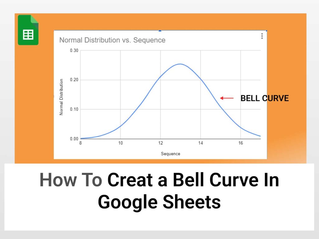
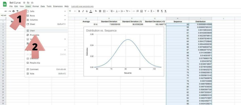
Time to visualize! Highlight “Sequence” and “Distribution” columns, head to “Insert”, then “Chart”. Opt for the “Smooth line chart” under the “Chart Type” section. Google Sheets brings your bell curve to life!
A spread-out bell curve indicates a greater standard deviation, while a peaked, slender curve signifies lesser deviation.
Bell Curves in the Wild
Often epitomizing the clustering of data around an average, bell curves find applications in scenarios like identifying outliers in a business dataset.
Imagine measuring student heights in a class. The bell curve might indicate most students hover around the average height, with taller ones on the curve’s right and shorter ones on the left. If you’re selecting a basketball team, the right-side outliers become more relevant.
Bell curves shine in representing stock performance, real estate values, academic grades, and more, especially when data gravitates around a certain average.
For instance, in a 1-10 rating, the bell curve could highlight that scores typically center around 7. Significantly deviant review sets might raise credibility questions.
This guide illuminated the process of chiseling a bell curve chart in Google Sheets. But remember, the journey of data interpretation is only beginning with chart creation.
Here’s hoping you gleaned insights from this guide!
