Navigating the vast realm of data visualization in Google Sheets might seem daunting. Although there isn’t a straightforward option to craft a funnel chart, fear not. With a touch of inventiveness and perhaps some scripting magic, you can still conjure one up. Dive in as we unveil different techniques to achieve this feat.
What’s the Essence of a Funnel Chart?

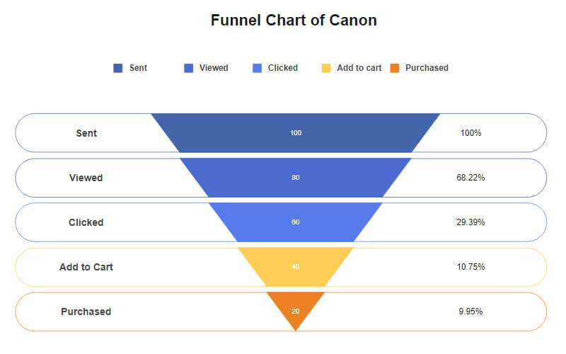
Picture an upside-down pyramid illustrating a series of connected, linear actions. That’s a funnel chart for you. It’s an impeccable tool for deciphering data patterns and gleaning valuable insights from data trends. For instance, breaking down a full-scale sales process into digestible chunks can be daunting. Present this through a funnel chart, and voilà, you’ve got a clear panoramic view of the sales journey.
A few funnel chart golden rules:
– Ensure data follows a linear, sequential path and is interconnected.
– The sequence is crucial, with each stage building upon the previous.
– The top tier should represent the largest data figure, tapering down like a funnel to the smallest data figure at the bottom.
Why Opt for Funnel Charts?
Here’s why funnel charts might be your best pick:
1. Simplified Data Interpretation: Walls of numerical data can be mind-numbing. Funnel charts bring the vibrancy of visual interpretation, simplifying complex data, especially in sales scenarios.
2. Spotting Inefficiencies: These charts highlight data volume at each phase, making it easy to pinpoint underperforming sections. Such insights can guide you towards areas ripe for enhancement.
3. Swift Data Summaries: Funnel charts offer a vivid snapshot of data progression. They underscore participation rates at each juncture, helping identify any lapses.
4. Workflow Mapping: Beyond sales, funnel charts trace operational flows, such as manufacturing processes, spotlighting hiccups and areas for optimization.
Constructing a Funnel Chart in Google Sheets: Built-in Chart Tool Method

Although Google Sheets lacks a direct funnel chart feature, fret not. Here’s a step-by-step breakdown using the built-in tools:
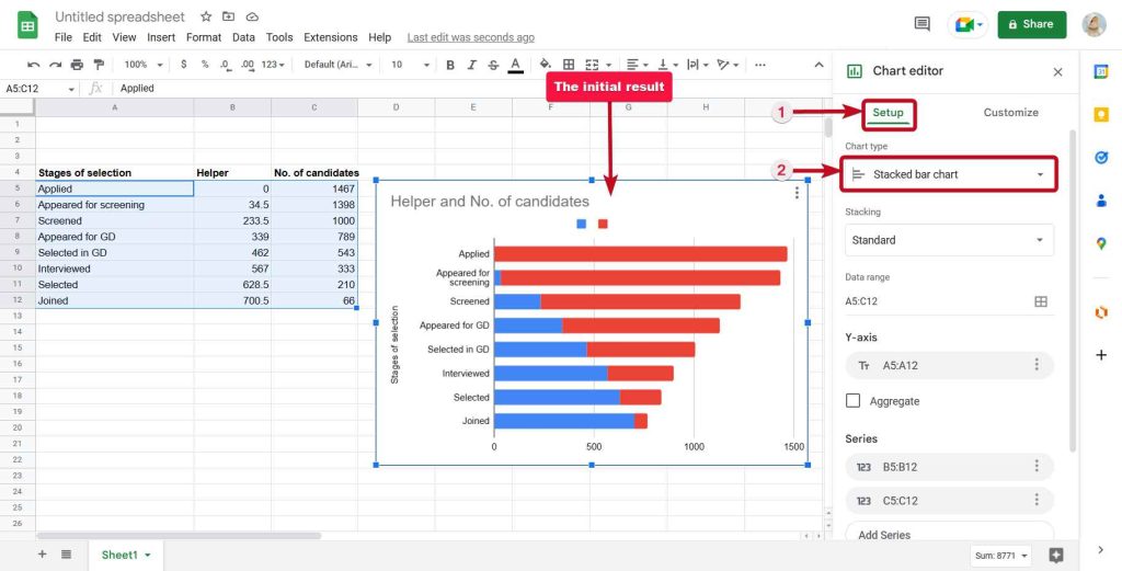
1. Data Entry: Populate your sheet with the desired data. Using a sample dataset: Column A labels the data; Column B offsets the chart; Column C gives the data count, shaping the funnel chart’s segments.
2. Charting Time: Highlight your data cells, head to the Insert tab, and choose the Chart option. At first, it may resemble a line chart rather than a funnel.
3. Chart Morphing: Using the Chart Editor, change the Chart Type to ‘Stacked Bar Chart’. Voilà, a silhouette resembling a funnel emerges! Customize away using the Chart Editor’s plethora of tools.
4. Axing the Helper Bars: To achieve the funnel’s authentic look, we don’t eliminate but rather render the helper bars invisible. Set the Line Opacity of these bars to 0%.
5. Chart Export (Optional): Ready to export? Click on your chart and choose the ‘Download’ option from the dropdown menu at the top right. Pick your preferred format, and it’s downloading time!
Remember, this method might not offer utmost precision, particularly if your offset values (like our Column B example) skew the final look. For optimal results, consider an add-on.
Creating a Funnel Chart Using an Add-on: The ChartExpo Way
To seamlessly craft a funnel chart, you can employ add-ons like ChartExpo. Here’s how:
1. Go to Extensions > Add-ons > Get add-ons.
2. Locate ‘ChartExpo’ (or your chosen add-on) and install it.
3. Once installed, ChartExpo should be available in the Extensions menu. Launch it.
4. From the ChartExpo dashboard, select ‘Create New Chart’, scroll/search for ‘Funnel Chart’, and proceed as guided.
Tweaking the chart to your preference is straightforward. Click on ‘Edit Chart’ to adjust textual content, font, labels, data representation, and more.
Pro Tips for Funnel Chart Mastery:
1. Consistent Stage Widths: To prevent misconstruing data magnitude, ensure uniform spacing.
2. Accurate Label Placement: Avoid extraneous sections at the funnel’s extremities and central label positioning, which might lead to incorrect interpretations.
3. Bar-Style is Best: Bar-style funnel charts prevent interpretation confusion by linking area dimensions with data figures.
4. A Minimum of Three Tiers: A funnel chart ideally needs at least three stages. Two steps? Opt for pie charts or stacked bars instead.
Seeking Google Sheets Funnel Chart Templates?
While templates can be handy, the most effective way to build funnel charts remains via add-ons. Thus, a standard template might fall short unless you’ve got the necessary add-on.

In Conclusion:
You’re now equipped to design funnel charts in Google Sheets. But remember, this tool brims with varied chart types. For deeper insights into these visual tools, peruse our extensive charting tutorials. Happy charting!
